
Having just posted my daughter’s birthday shirt, I realized that I had forgotten to post my other daughter’s birthday shirt!
Yes, I am into drawing bunnies. There’s nothing wrong with that.

Share this:

Well, it was my daughter’s 12th birthday recently, and as is the family tradition, we made her a birthday t-shirt. The honour to design it fell on me this year. What rhymes with 12?

Share this:

Hey, Seattle area folks – Peter Ferguson is having a new show in December, at Kirsten Anderson’s new art space!
Via Peter’s Facebook page:
“HEY YOU GUUUUYS !
I just wanted to tell you about my new show !
It’s called ” I Will Line My Nest With Your Bones ” with 6 new paintings , and I’m proud that it’s at the opening of Kirsten Anderson’s new surrealist decor space , Creatura House . It’s in the Pikey area of Seattle, which I hear the young people think is pretty rad.
I’m so glad ( and so are you ) that Kirsten has come back to the art world . We missed you !!! 16 months may not seem like a long time to aSouthern Right Whale , but is an eternity if you’ve been locked in an abandoned refrigerator with no food or water, or even comic books .
There’s also going to be ” a line of evening bags from Jordan Christianson ( Yay ! ) of Jonquil & Mr Black, crystal necklaces by artist Debra Baxter and an animal-centric range of flocked trophy sculptures by design collective Electric Coffin.”
It opens Dec. 15th . I’m not saying you have to be there. Just that I’ll know if you weren’t , which I shall write down on my little clipboard.”
Here’s a taster of his new work – looks incredible, as always.

Share this:

Well here we are yet again, another tour around the sun and we find ourselves back at the Christmas part. As always, I have made Christmas cards and sent them out to everyone on my mailing list… if you are not on my mailing list, enjoy this digital version!
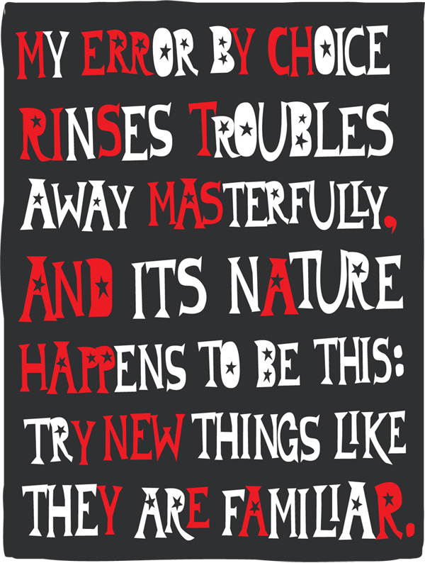
Hand made lettering – & it’s not spam poetry, it’s an encoded message.


R.I.P. David Bowie, 1947-2016
RIP David Bowie, one of the great artistic geniuses of our time. We all know him as a musician, actor, and erstwhile painter, but he was also a very astute cultural observer. Here he is in an interview from 1999, discussing the internet and how it will change the creative process. Remarkably forward thinking, and spot on with his predictions.
Here are a few select quotes from Bowie in this interview:
“We are living in total fragmentation”
“It’s almost like the artist is to accompany the audience, and what the audience is doing, and that feeling is very much permeating music, and permeating the internet”.
“The breakthroughs of the early part of the century with people like Duchamp who were so prescient in what they were doing and putting down, the idea that the piece of work is not finished until the audience come to it and add their own interpretation, and what the piece of art is about is the grey space in the middle. That grey space in the middle is what the 21st century is going to be about.”
“Art is either plagiarism or revolution.” ― Marcel Duchamp
Share this: