The Mystery of the Colonel
My favourite logo design EVER is the 1978 redesign for Kentucky Fried Chicken by the design agency Lippincott and Margulies.

Amongst many, many other iconic projects, this agency designed the classic logos for Betty Crocker & Chevron, the classic Campbell’s soup can immortalized by Andy Warhol, and they created the white swoosh brand for Coca-Cola.
In the 1940s, our founder Gordon Lippincott coined the term “corporate identity”.
He proposed that companies brand themselves with the same thoughtfulness and creativity typically reserved for their products.
– Lippincott.com

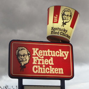
Lippincott & Margulies designed the original Kentucky Fried Chicken branding in 1952, and revisited the brand in 1978, which, to my mind, is the “classic” brand. True, this is the version I grew up with, but the departure that makes this brand redesign significant is that it was the first in which the face of Colonel Sanders was used separately as a logo from the “Kentucky Fried Chicken” logotype – in some applications, at least. The drawing style was also made less realistic, more stylized, and more iconic, creating a graphic presence with much stronger impact. In effect, by elevating the face of the Colonel to iconic status, it was able to represent the entire Kentucky Fried Chicken brand by itself. It was sometimes used by itself on backlit signage to indicate a Kentucky Fried Chicken store in a food court setting, on container lids and other packaging, and in a few instances, glorious illuminated chicken-bucket-shaped watertowers that would glow in the night along city highways, the immediately recognizable Colonel’s face like a beneficient deity of comfort and hominess. Are you hungry, weary traveller? Then eat of my chicken.
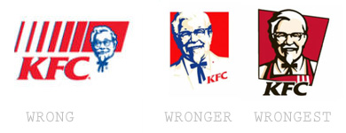
The Kentucky Fried Chicken logo was revisited in 1991 with its “new look” horizontal pseudo-gradation and the usage of KFC instead of “Kentucky Fried Chicken”, reputedly to disguise the “fried” aspect. Clearly the designers were idiots, but if you own a fried chicken company and are worried about the word “fried”, sell the company to someone that appreciates the brand heritage and isn’t such a bottom-line stooge. I was unsettled. When the Colonel’s face was redone to look like some kind of grimacing mockery of itself in 1997, angled like a reeling drunkard, I was horrified. The 2007 redesign looks like a crazed Vladimir Lenin in a wig and racing-striped dirndl.

When a brand is created focusing on reassuring, homey, “classic” qualities and is completely redesigned to be “fresh and edgy”, the result reeks of insincerity – and destroys all the hard work of building a “classic” brand identity that preceded it. Gaze upon the face of the 1978 Colonel, designers, and take heed.
One strange thing I’ve noticed is that while KFC is generally very consistent in its branding, one instance of the 1978 Colonel logo survives – the embossed lids of the small salad containers, at least here in Quebec. It seems strange that this one thing has remained unchanged for nearly 25 years. I’ve contacted corporate to see if there is a reason, and I will update this article when I receive a response.


[…] on my back; the base nature that leads us towards unhealthy but delicious choices… also, the 1970s KFC branding is a classic example of the 70s golden age of mascot design, which is another of my personal […]
I so agree! Isn’t it likewise a shame that Long John Silver’s got a trendy makeover? Nautical stuff and pirates go so much better with fried fish and chips than pastel colors and photographs of sailboats.
I appreciated this history of the KFC logo! I am working on a project that needs to adapt it for personal use, and am definitely going to use the 1978 version as the inspiration! I will go as far as to say that Kentucky Fried Chicken tasted better in the 80s than it has ever since. I suspect they downgraded the recipe along with the logo…The Colonel would be disappointed.