
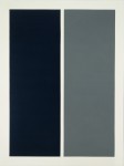
Gerhard Richter on Grey
Grey. It makes no statement whatever; it evokes neither feelings nor associations: it is really neither visible nor invisible. Its inconspicuousness gives it the capacity to mediate, to make visible, in a positively illusionistic way, like a photograph. It has…
Share this:

Post Roundup – the Book of Faces Edition II
This week’s topics: Women in Street Art, Colour Use in Marketing, Vintage Cookbook Illustrations, the Psychology of Over-Exposure to Art, a New Show by Jenny Holzer, and Scientific Illustration of Ugly Extinct Creatures as Body Art. Whew! It’s not every…
Share this:

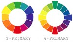
Rethinking the Colour Wheel
When we’re taught the colour wheel in art class, we learn the 3-primary colour wheel. Red, yellow, and blue are the primary colours, orange, green, and violet are the secondary colours. This is where we get complementary (opposite) colours as…
Share this:


Colour Theory Monday – Pattern and Pixels
Hey kids, it’s colour theory Monday! Today we talk a bit about how displays work, how the eye works, and how to take advantage as a designer. Visual perception is a funny thing. If we are shown 24 sequential drawings…
Share this:


Colour Theory Monday – Colour Temperature
Last week I explained how simultaneous complementary contrast can be used to make a low-saturation composition appear more dynamic. Carrying that idea one step further, I’m going to explain contrast of temperature and show how warm and cool greys can…

